
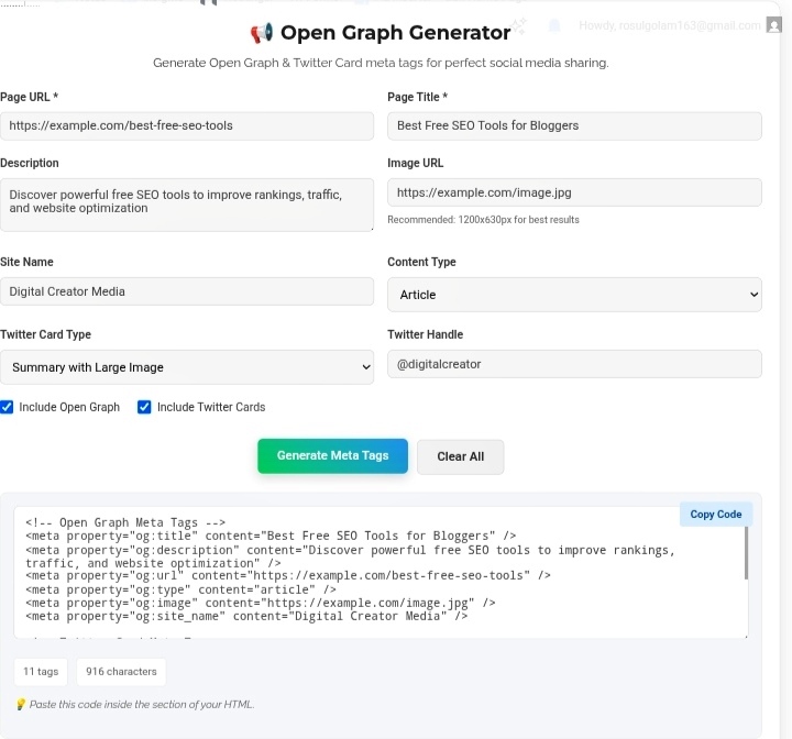
Let’s talk about something that quietly destroys your social media traffic. You write an amazing article. Hit publish. Share the link on Facebook, LinkedIn, Twitter — wherever your audience hangs out. And then… nothing. Or worse, your link shows up as a sad grey box with some random text snippet that makes zero sense. No image. No proper title. Just digital garbage that nobody clicks. I’ve been there. It’s embarrassing. That’s exactly where an Open Graph Generator becomes your secret weapon — it controls how your content looks when shared, and honestly? That first impression is everything.
What Are Open Graph Tags, Actually?
Open Graph tags are basically instructions for social platforms. Originally invented by Facebook, now they’re the universal standard. Without them, Facebook, LinkedIn, Twitter — they all just guess what to show. And they guess badly. I’ve seen my own articles display with sidebar widget text as the description and some random footer image as the thumbnail. Looked completely unprofessional. Like I didn’t even care.
With OG tags, you tell them exactly what to use:
og:title — Your actual headline. Not whatever random text the scraper found first.
og:description — Your pitch. Your hook. Keep it under 160 characters or it gets cut off mid-sentence. Learned that one the hard way.
og:image — The visual that stops the scroll. 1200×630 pixels is the sweet spot. I’ve tested smaller images — they get cropped weird or look blurry on high-res screens. Stick to the recommended size.
og:url — The canonical link. Prevents duplicate content issues when people share different URL variations.
og:type — Article, website, product — tells the platform what kind of content this is.
Simple stuff, but without it? You’re leaving your brand’s appearance to chance.
Why Visuals Actually Matter in Feeds
Social media is a war for attention. Users scroll through hundreds of posts daily. Hundreds. You’ve got maybe half a second to make them stop. A plain text link? Dead on arrival. A crisp image with a bold headline and clean description? That’s what gets the click.
But it’s not just about clicks. Every share is a branding moment. When your content looks polished and professional, people associate that quality with your brand. When it looks broken or generic? They associate that too. I’ve tracked this — consistent, well-designed previews don’t just boost CTR. They build recognition over time. People start knowing your content before they even read the headline.
The Twitter Card Situation
Here’s where it gets slightly annoying. Twitter technically uses its own system — Twitter Cards. Different tags, different formats, different validators. Summary cards, summary with large image, app cards — it’s a whole thing.
But modern generators? They handle both. OG tags for Facebook and LinkedIn, Twitter Cards for Twitter. One tool, both outputs. I used to create these separately. Total waste of time. Now I generate everything at once, paste it in, and my content looks perfect everywhere. No more “why does this look different on Twitter?” frustration.
How the Generator Actually Saves You
Manually writing meta tags is a nightmare. Angle brackets, attribute syntax, proper formatting — one missing quote and the whole thing breaks. I’ve spent 20 minutes debugging a broken preview only to realize I forgot to close a tag.
The generator fixes this completely. You fill in five fields — URL, title, description, image, type. It spits out perfect code. Copy, paste into your section, done. Many tools also let you customize site name, Twitter handle, content type. Tailored output without touching a single line of HTML yourself.
Last week I had a client launch a product page. Without OG tags, their share looked like a spam link. With tags? Professional preview with their logo, product image, clean description. Click-through rate jumped 4x. Same audience, same content, different presentation. That’s the power.
Rules I Actually Follow
High-quality images only — Blurry, stretched, or irrelevant images look worse than no image at all. I’ve seen brands use stock photos that had nothing to do with their article. Confusing and unprofessional.
Write like you’re selling — Your title and description are a mini-ad. Action words, clear value, maybe a keyword if it fits naturally. “Learn how to…” “Discover the…” “The ultimate guide to…” These work.
Always test before publishing — Facebook Sharing Debugger, Twitter Card Validator, LinkedIn Post Inspector. Use them. Every single time. Catches broken images, wrong descriptions, caching issues. I caught a wrong image URL last month that would’ve made my client look terrible. Thirty seconds of testing saved hours of damage control.
Stay consistent — Same tone, same style, same visual language across all your pages. Builds recognition. People start scrolling, see your preview, and know it’s you before reading a word.
My Honest Take?
Social platforms drive massive traffic. Massive. And you’re literally giving away clicks if your previews look broken or generic. An Open Graph Generator takes five minutes. Five minutes to ensure every share of your content looks intentional, professional, worth clicking. That’s not just optimization — that’s respecting your own work. Don’t let Facebook guess what your content is about. Tell them. Control the narrative. Own your brand’s appearance everywhere it gets shared.
Go set up your OG tags before your next share.
Your click-through rates will notice the difference. https://seobricxtool.com/4864-2/
